3 Things You Didn’t Know About the Starbucks Brand
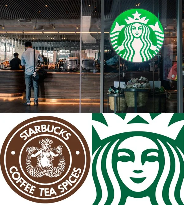
Above An illuminated sign featuring the now familiar Starbucks branding, the original (1971) logo leaving nothing to the imagination, and the asymmetric siren, up close and personal
1. The Name
Starbucks gets its name from the novel Moby-Dick. Starbuck was the First Mate aboard Captain Ahab’s ship, and the founders chose the name for its strong nautical feel. Something that reflected both a sense of adventure and the seafaring history of Seattle, where the company was born.
2. The Siren
Continuing the maritime theme, the Starbucks logo features a twin-tailed mermaid, meant to lure coffee lovers in. The design is said to be inspired by a 16th-century Norse woodcut (though that’s debated, the Norse angle is too good to ignore!). Over the years, the original, risqué version has been simplified several times, evolving into the clean, modern icon we see today.
3. The Secret You Can’t Un-See
Here’s the part that’ll stick with you: the siren’s face is deliberately asymmetric. During a rebrand, designers realised that a perfectly symmetrical face made her look uncanny, almost alien. To add warmth and humanity, they gave her slight imperfections. Look closely: the shadow on the right side of her nose is longer. Once you notice it, you can’t unsee it.

