Rebrand - case study
With work supporting leaders across the Health and Business sectors, Allegra Impact has built a strong foundation for growth. Having worked previously across Europe and beyond, and with fluency in five languages, the business is well-positioned for further expansion, both in the UK and internationally.
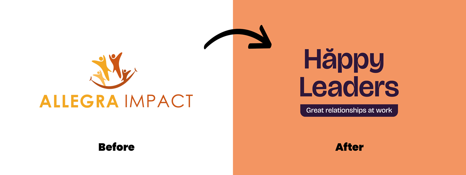
With that in mind, we realised the brand could speak more clearly to prospective clients. Making it instantly obvious what is on offer and why it matters. The existing name, drawn from the Latin for joy, relied on translation to convey meaning and could feel generic without it. Prompting the question: Impact how?
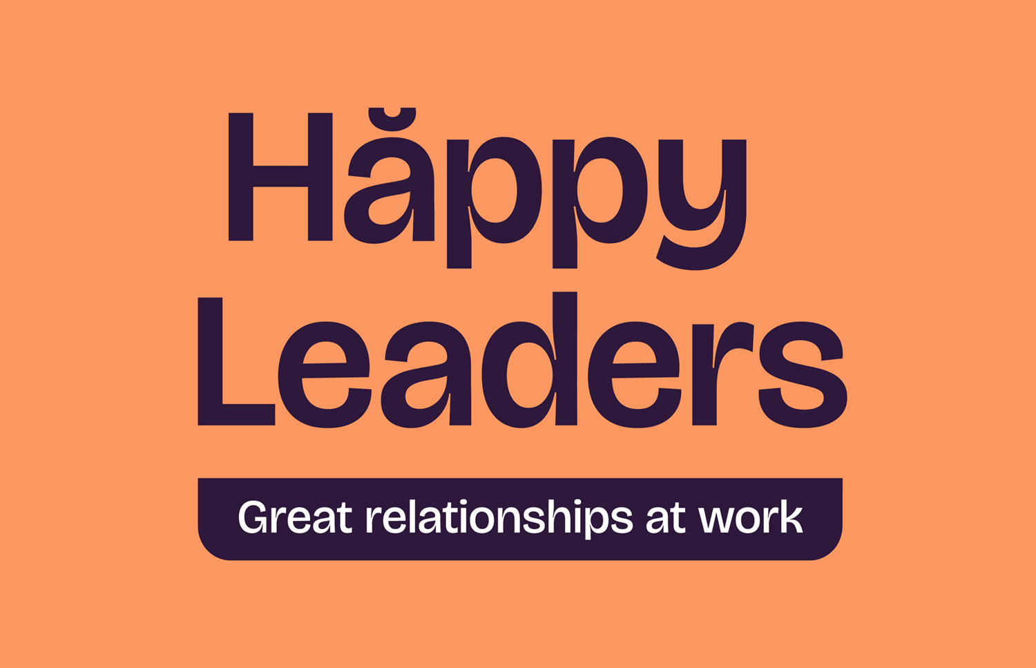
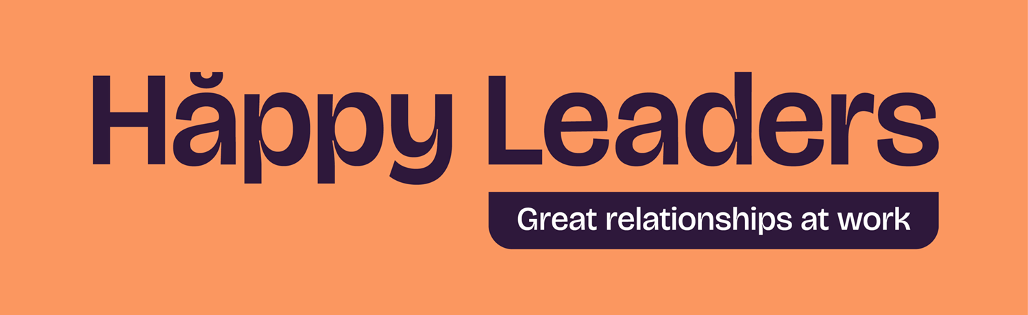
That question became the spark for a deeper exploration of what the business delivers. After consideration, a new name was chosen: Happy Leaders, supported by the strapline “Great Relationships at Work.”
The name is immediate, easy to understand, memorable, and readily translatable. More importantly, it goes straight to the heart of the offer: happier leaders creating better relationships, stronger teams, and positive results.
Happiness is a universal goal, but in a professional context, it reflects trust, respect, and alignment with organisational values. The conditions that enable people to thrive. The creative challenge lay in finding the right balance between the lightness of “happiness” and the credibility expected in a business setting.
To avoid clichés and explore new ways of representing happiness, the creative process began with questions like:
What are the happiest colours?
Can a typeface feel happy without being frivolous?
How can design convey professionalism and warmth
in equal measure?
The outcome is a brand that recognises that the real secret to balance and success at work lies in perspective, and in not forgetting to smile occasionally.
“The process was structured, thorough, AND really enjoyable! Matt got to the core of my business, what I do, and how I do it. He then perfectly represented that with a brand new business name and superb graphics.”
Heather Bellin, Happy Leaders
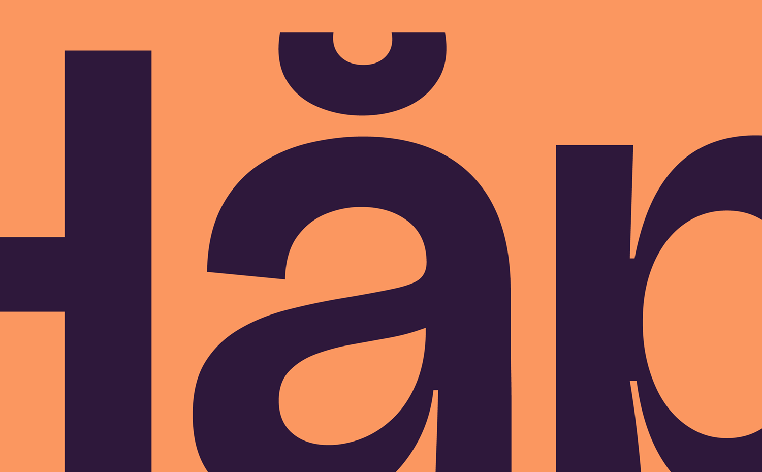

Putting the Accent on Happiness
The breve over the “a” in Happy is a playful design flourish, not a pronunciation cue. While the breve is relatively rare, appearing mainly in Romanian and Vietnamese, it occasionally appears in English to indicate a short or unstressed vowel, which happens to suit Happy perfectly.
More importantly, the accent was chosen for its visual appeal. Its curved shape resembles a smile, echoing the brand’s light-hearted, mischievous personality. It’s a small, intentional detail designed to raise a smile.
Reflecting the brand’s ambition to grow internationally, the accent also gives Happy a cosmopolitan, European edge, signalling relevance and reach beyond the UK.
The colour palette is bright, simple, and optimistic. Peachy Orange delivers an unmissable punch, while Business Blackcurrant provides weight and balance. Less harsh than black, and twice as sweet.
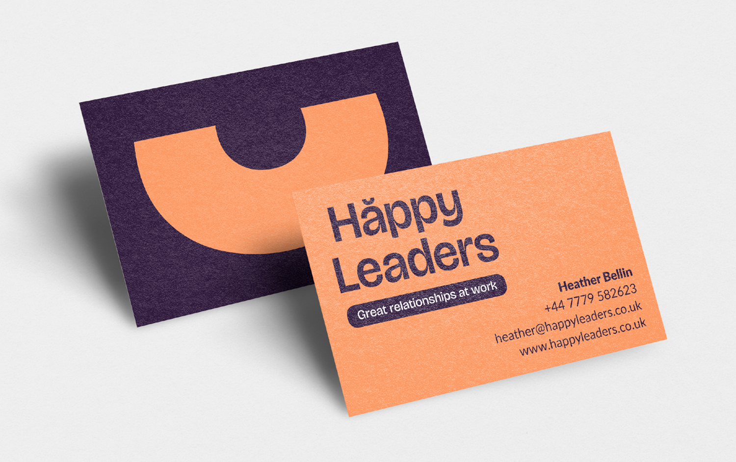
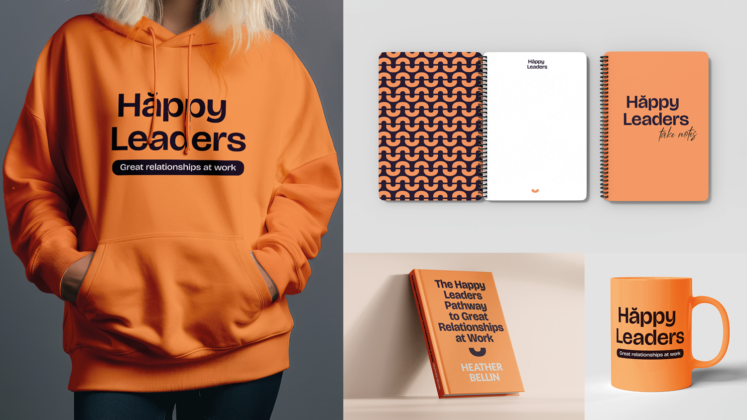
Flexible brand toolkit
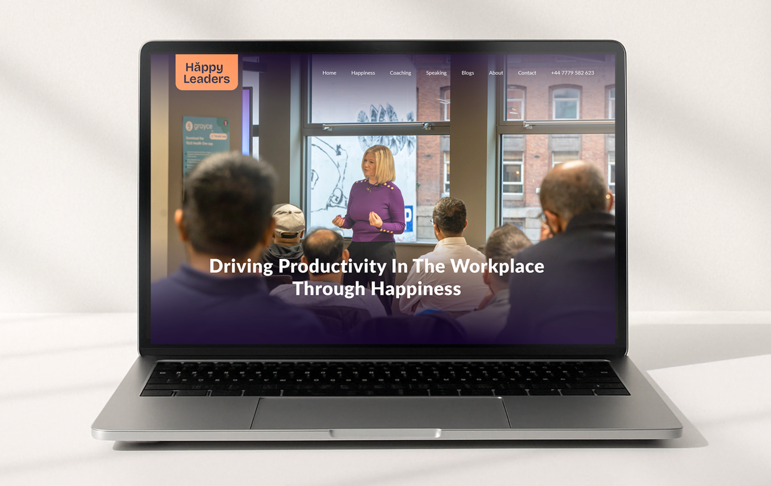
As with all Valhalla Branding projects, a flexible set of brand assets were created to deliver the Happy Leaders brand across multiple platforms. Business cards, branded clothing, notebooks and mugs. As well as different orientations of the logo to ensure the brand can be applied digitally on the website, social media and presentation slide decks.

Transformation
Is your business ready to grow, but your brand feels like it’s holding you back? Maybe it’s time for clarity. Knowing exactly how to describe your business and excite your customers about what you offer is the first step.
The Valhalla Branding process helps you unpack everything you know about your business and reframe it into a powerful, easy-to-understand message. In the battlefield of business, your brand can be your sharpest weapon.
If you’re ready to sharpen yours and cut through the noise, preparing your business for victory, hit the button below.