
At a Glance
Client: Conflict Resolution
Sector: Workplace Culture • Mediation • Investigations
Services: Discovery • Brand Strategy • Visual Identity • Brand Guidelines • Website Direction
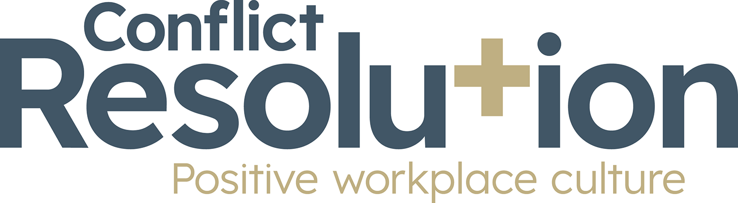
Project Goal: Reposition the business from resolving workplace conflict to helping organisations build positive workplace cultures.
The Challenge
Conflict Resolution had built a respected reputation helping organisations navigate difficult workplace situations through mediation, investigations and culture audits.
But during the discovery process, it became clear that the business had evolved. Whilst conflict resolution remained an important part of the service offering, the bigger ambition was to help organisations create positive workplace cultures where conflict was less likely to arise in the first place.
The challenge was finding a way to communicate that evolution without losing the credibility and discoverability of an established business name.
The Discovery
One conversation changed the direction of the project. People don't aspire to become better at resolving conflict. They aspire to create workplaces where people communicate openly, trust one another and work together successfully.
Conflict Resolution wasn't simply helping organisations recover when relationships broke down. It was helping them build healthier workplace cultures that prevented many of those problems from occurring in the first place.
That insight became the foundation of the entire brand. The new strapline, Positive Workplace Culture, captures this shift perfectly, repositioning the business around the outcome clients truly want, rather than the problem that first brings them to the business.
“The discovery session set the tone for the whole project. Matt really helped me to identify what my business stands for and how I want clients to see it.”
Jon Dunn, Conflict Resolution
Why Resolution Takes Centre Stage
Changing the name was never the answer. The words Conflict Resolution remain strategically valuable because they clearly describe the services many organisations are actively searching for.
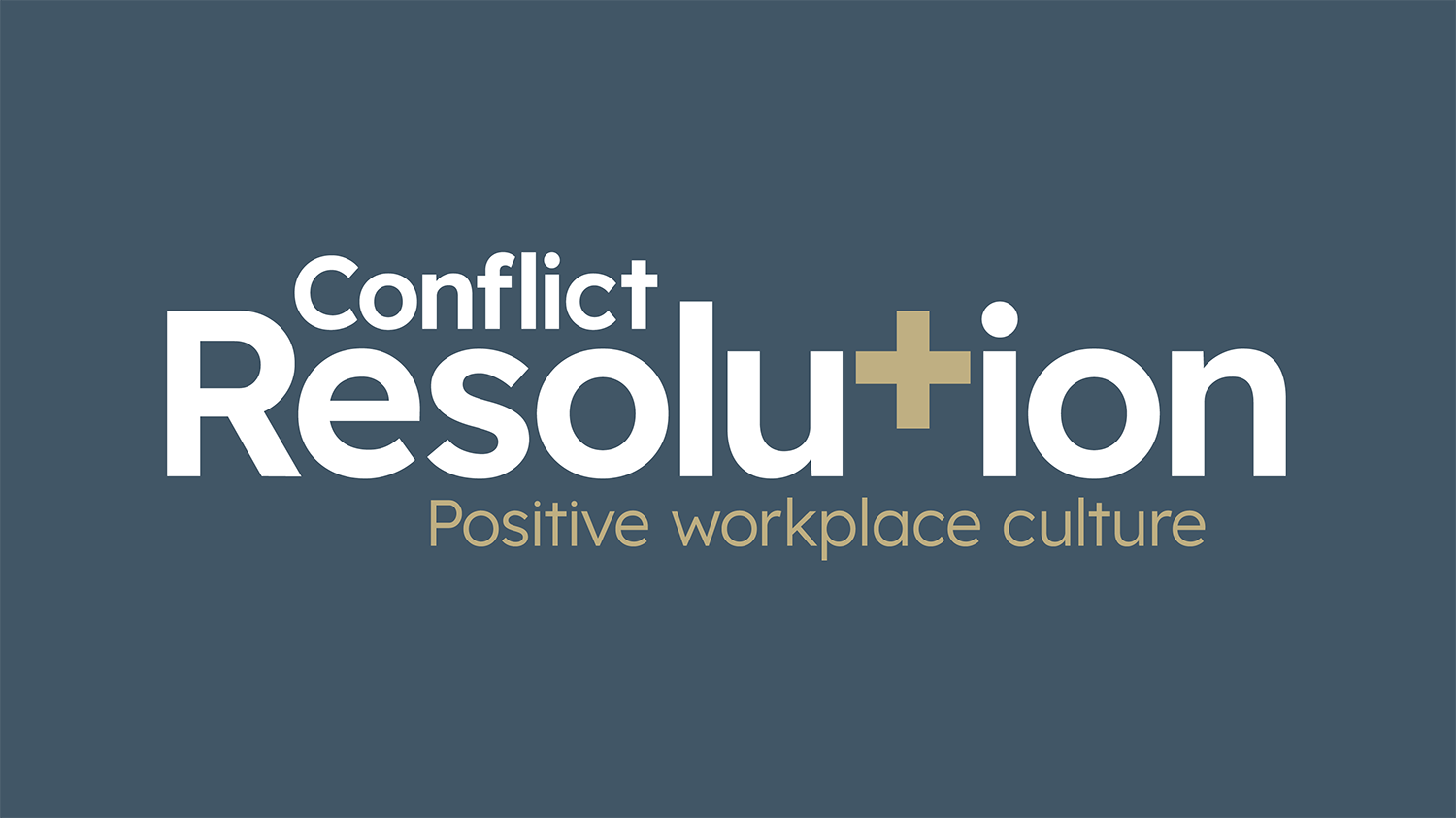
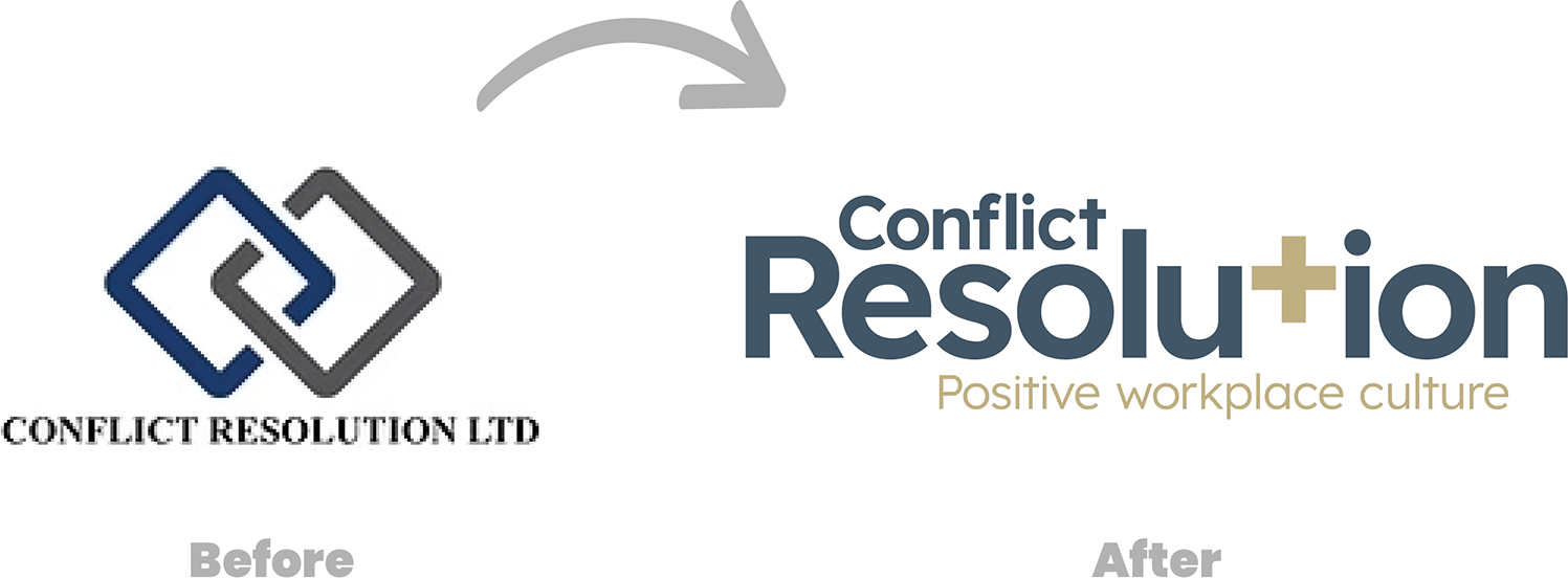
Instead, the hierarchy within the logo was reimagined. Resolution became the dominant element, while Conflict was intentionally given less visual emphasis.
It's a subtle shift, but an important one. The eye is naturally drawn towards progress rather than problems, reinforcing the direction in which the business is heading without sacrificing the recognition it has already earned.
A Symbol of Positivity
The identity needed a simple idea capable of expressing the brand's philosophy wherever it appeared.
That idea became the '+'.
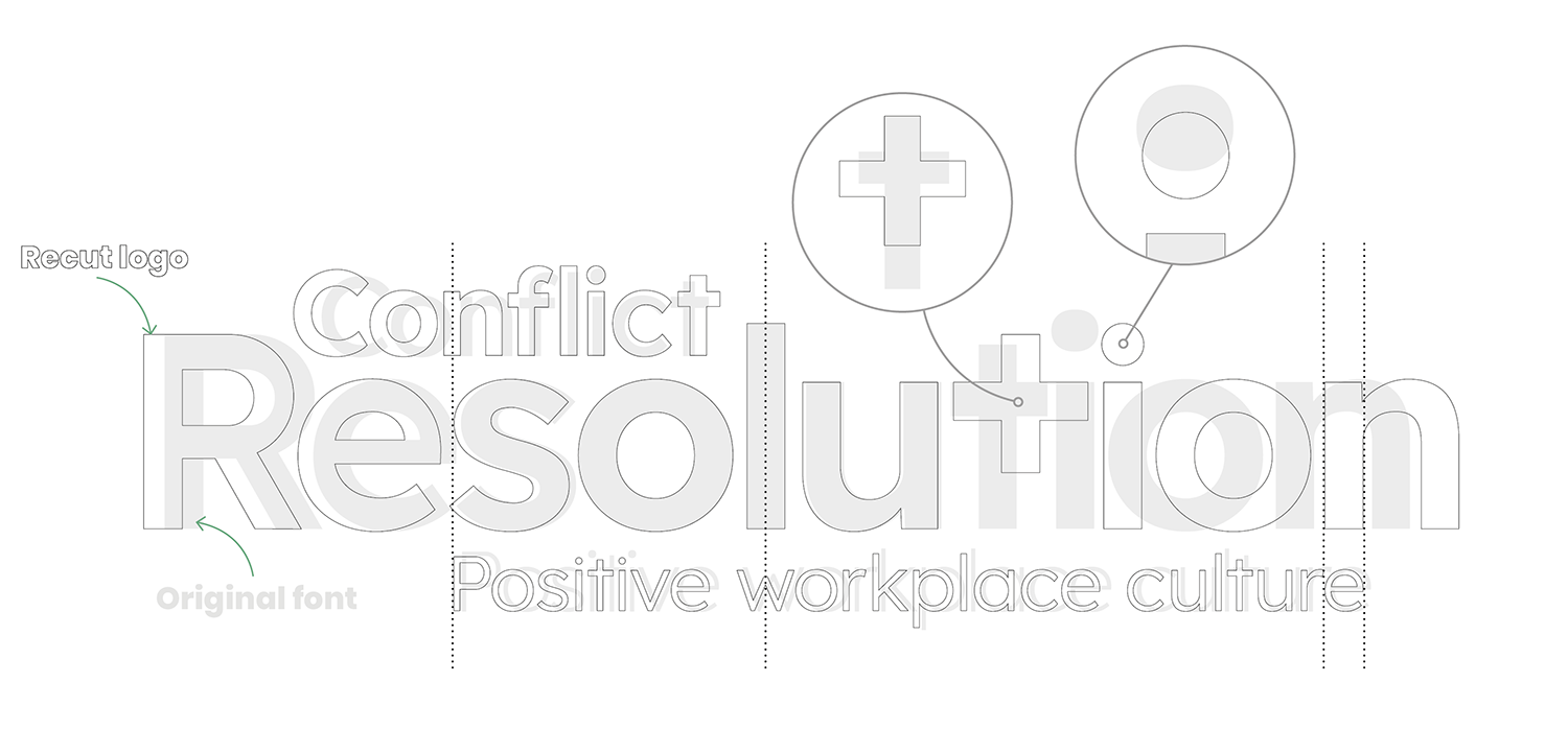
The letter 't' in Resolution was transformed into a positive symbol, creating a visual link with the new strapline whilst representing collaboration, optimism and positive outcomes.
More than a logo detail, it became a distinctive brand asset that runs throughout the identity, giving the business a recognisable visual signature capable of standing on its own over time.
Every Detail Reinforces the Idea
Every design decision was guided by the same strategic thinking.
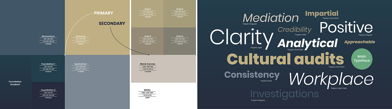
The typography balances professionalism with approachability.
A restrained colour palette communicates trust, confidence and momentum.
The logo itself was carefully refined to create a calm, balanced composition, with even the smallest typographic adjustments contributing to a more harmonious identity.
Nothing exists simply for decoration. Every element supports the same story: helping organisations move towards healthier, more positive workplace cultures.
Beyond The Logo
The '+' symbol quickly evolved into the foundation of a wider visual language.
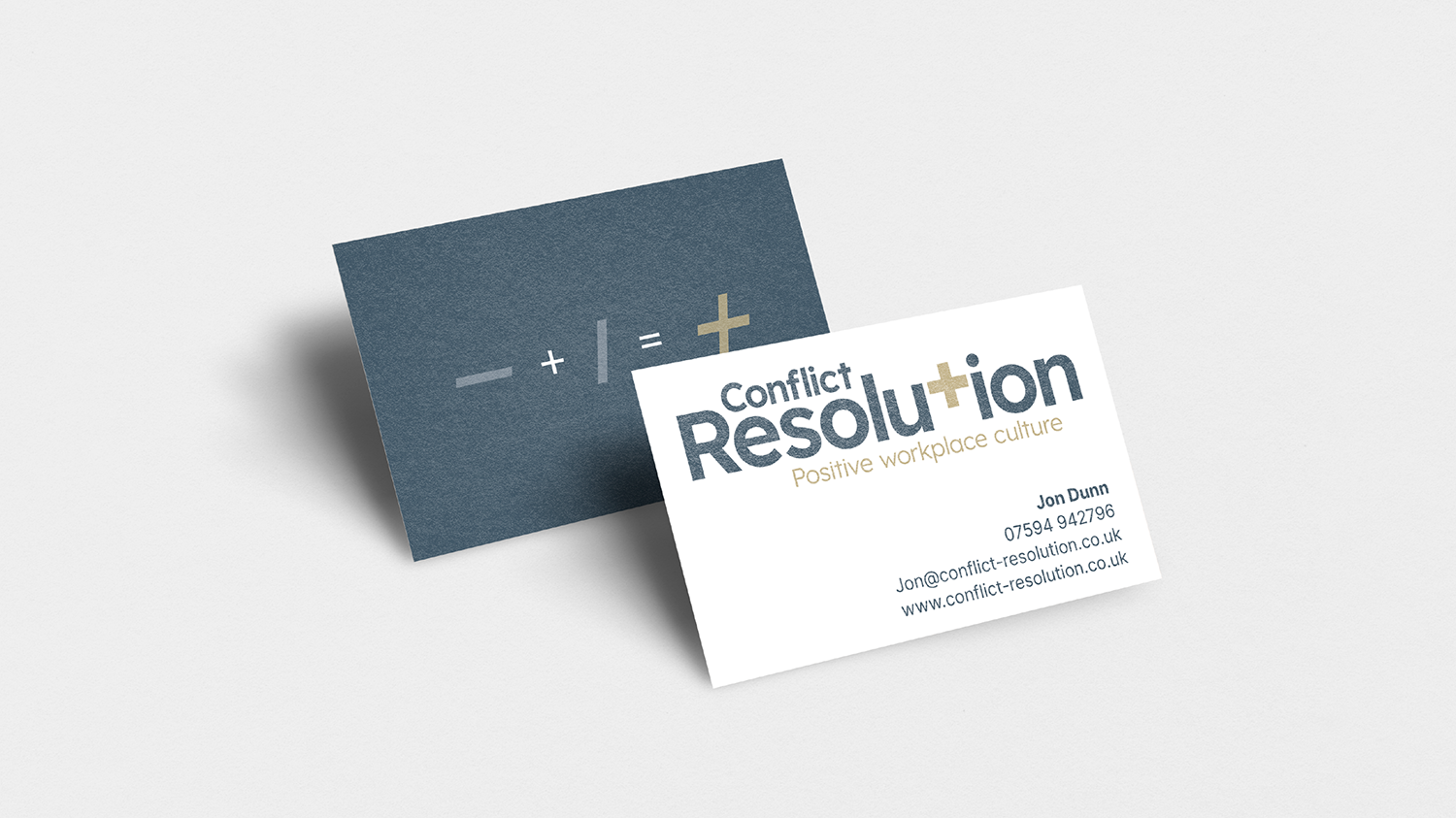
This led to the development of the Equation brand asset, inspired by mathematical notation. Beginning with a negative symbol, moving through division and arriving at a positive outcome, it reflects the belief that bringing different perspectives together can create stronger relationships and better results.
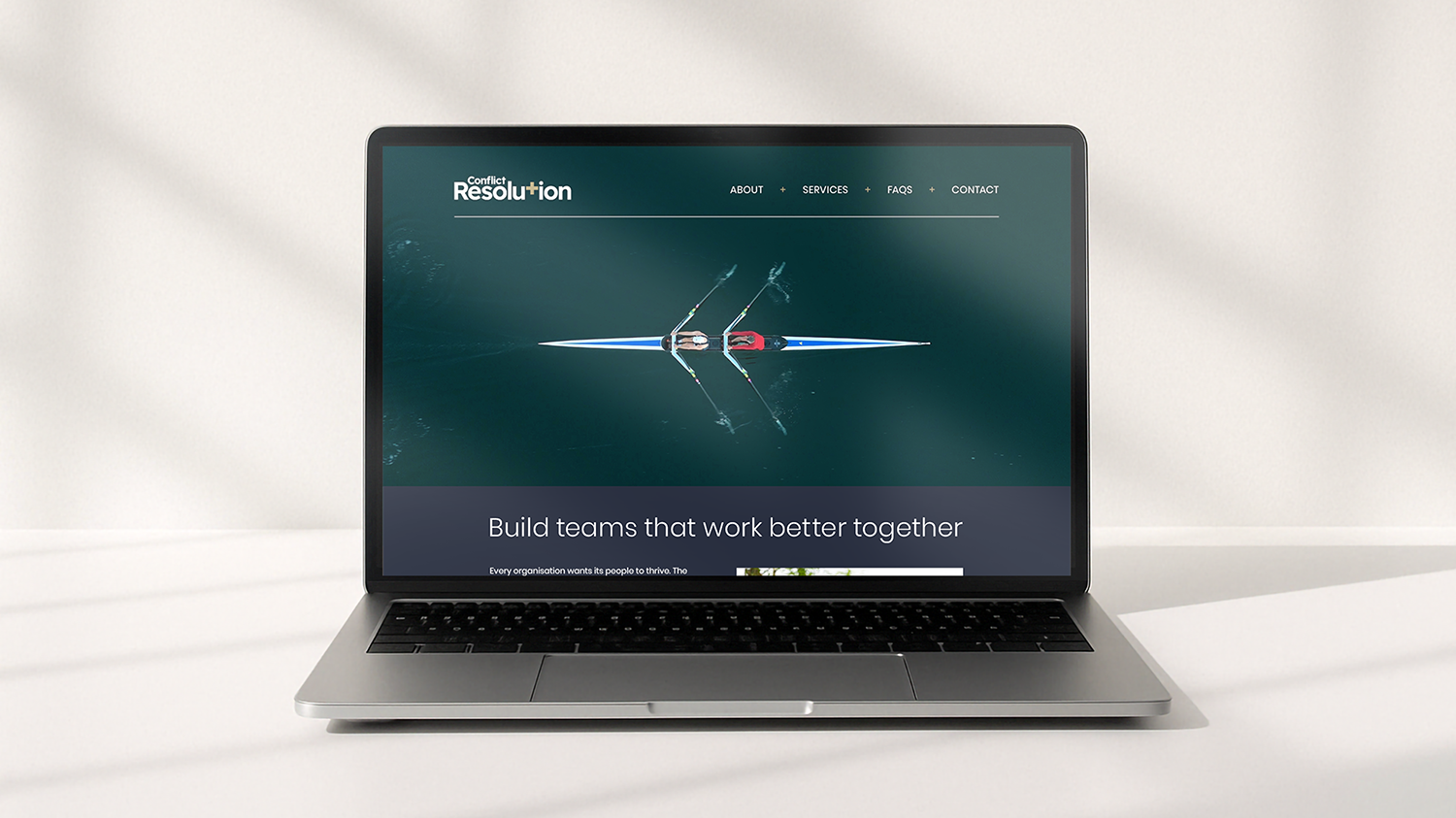
The same thinking informed the supporting imagery. Rather than relying on predictable corporate photography, the brand uses rowing as a metaphor for collaboration, alignment and shared purpose. Capturing the outcome the business helps its clients achieve rather than the services it provides.


The Result
The new identity reflects the evolution of the business without losing sight of its heritage.
It remains instantly recognisable to organisations seeking mediation and investigation services, whilst communicating a broader ambition to help businesses build positive workplace cultures that thrive long before conflict takes hold.
The result is a confident, optimistic brand built around a single strategic idea. One that shifts the conversation away from conflict and towards the positive future every organisation wants to create.
“Matt demonstrated a level of detail and a depth of creativity that I had not expected. My brand now conveys not only what my business offers to my clients, but also my nature and values.”
Jon Dunn, Conflict Resolution
Could your business benefit from a Discovery?
Every successful project featured here began with the same question:
What makes this business genuinely different?
Sometimes the answer is obvious. More often, it’s hidden beneath years of evolution, assumptions and day-to-day familiarity.
Discovery uncovers those insights and turns them into the foundations of a brand that’s built to last.