Garage rebrand project
Just Right Autos is a garage based in Witney, Oxfordshire.
Before setting up this family business, the owner worked as a mechanic for the Fire Service, and his wife worked in the ambulance service.
Their mission is to help ordinary people get on with their lives by servicing and maintaining their vehicles. The approach is one of honest transparency. Clear communication and inclusive pricing. They aim to deliver the same service to their customers as they would do to their families.
The challenge was to create a brand that reflects this approachable and dependable service and provide people with a sense that they will be looked after with care.
Discovery Process
During the Discovery process, a name change was considered, but the conclusion was reached that 'Just Right' captures the brand perfectly.
We added a strapline to reflect the newly clarified mission - keeping people's cars on the road and allowing them to go about their lives with the least interruption. Right for you. Right for your car.
The final wording ‘Keeping you on the road’ references the 'why', rather than the process itself.
“Before I went to Valhalla, I wasn't even sure if I liked my company name. Now, I'm happy to see my brand anywhere.
Matthew knew the right questions to ask and quickly got me thinking about why I started my business. We spent time considering who my customers are and understanding what they need from a garage.”
Martin Hambidge, Owner

The logo
The solid and approachable wordmark delivers a sense of reliability with its bold weight and friendly, soft, rounded corners.
The wordmark features 'hidden' road markings running through the R and A.
The spanner symbol references the tools used to carry out the brand mission. The phrase 'on the spanners' translates as physically working in the garage and thus represents the whole process.
The ring end of the spanner also informs the shape of the Social Media avatar.

Colour Palette
The primary Fire Engine Red is inspired by the business owner's history as a mechanic in the fire service. Orange shades suggest warmth and encourage confidence. In driving terms, Amber also says that you'll soon be on your way.
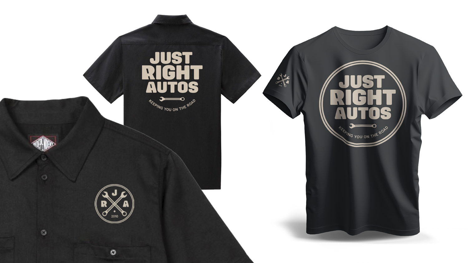
Asphalt - the darkest colour in the palette, reminds us that keeping customers on the road is the brand's mission. The neutral Uniform hue completes the set and is again inspired by the fire service (this time firefighters uniforms). Appropriately, it is used prominently in the designs for the mechanic's work shirts


Wider visual brand palette
The ‘lane lines’ road markings and spanner icons have been translated into additional visual elements. For example, the ‘Gridlock’ brand pattern (below) and the ‘A to B’ lines. These elements add variety and visual interest whilst expanding upon the brand story.


“Matthew was very patient as we worked through the process. The best part was seeing the work come together and transform into something I'm proud of.
I thought that all I needed was a logo. What I got has reconnected me with my company values. It was money well spent.”
Martin Hambidge, Owner

If you’d like to service your branding, and prepare it for the road ahead, use the button below to book a FREE Fearless Brand Review.
It’s like an MOT for your brand!
