The Challenge
Cazology is a skills-based learning methodology designed to strengthen clarity, capability, and resilience in students navigating higher education.
Rather than teaching course content, Cazology enhances how students learn. Helping them think more clearly, plan more effectively, and respond more confidently to the complexity of university life.
Working alongside UK education institutions, the programme embeds a structured learning methodology that builds transferable capabilities across disciplines.
The challenge for the brand was clear:
How do you communicate a radical shift in the way learning is approached, in a sector that is visually and culturally rooted in tradition?
Most education brands default to familiar visual cues: institutional typography, academic symbolism, and a sense of formal authority.
But Cazology isn’t reinforcing the traditional model of learning. It’s reframing it.
Strategic Framing
The brand positioning centred on a simple but powerful idea: Learning Reframed
This strapline captures the role Cazology plays within education. Not replacing existing teaching, but changing the way learners engage with it.
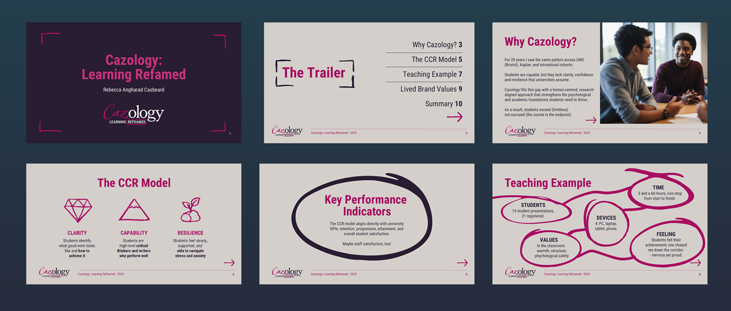
Cazology’s methodology is built around the CCR Framework: Clarity, Capability and Resilience, helping students develop the underlying skills required to consistently perform across academic environments.
By strengthening these capabilities, learners gain more than academic success. They develop the mindset required to navigate complex systems, solve problems, and carry confidence into life beyond education.
This meant the brand needed to express a shift in perspective. Not just a new programme, but a new way of seeing learning itself.
Matt’s curiosity brought out the best in me as a founder and it shows in the visual work we co-created. He speaks with such passion that you just get pulled into his creative nature.
Rebecca Casbeard, Founder
The Creative Idea
The core creative territory emerged from a tension between two worlds:
The old way of learning
Structured, formal, and institutional.
The new way of learning
Human, confident, intuitive, and empowering.
Visually, this contrast is expressed through a deliberate clash:
Polished typography representing the established education system
Energetic hand-drawn mark-making representing the act of reframing it
The concept evolved around a simple metaphor:
Taking a Sharpie to the established way of doing things.
Rather than timidly correcting outdated approaches, the brand boldly redraws them.
This gesture of confident mark-making becomes the central visual idea . A symbol of clarity, accessibility, and decisive thinking.
It signals that Cazology is not here to edit the margins of education.
It’s here to rewrite how learning is experienced.
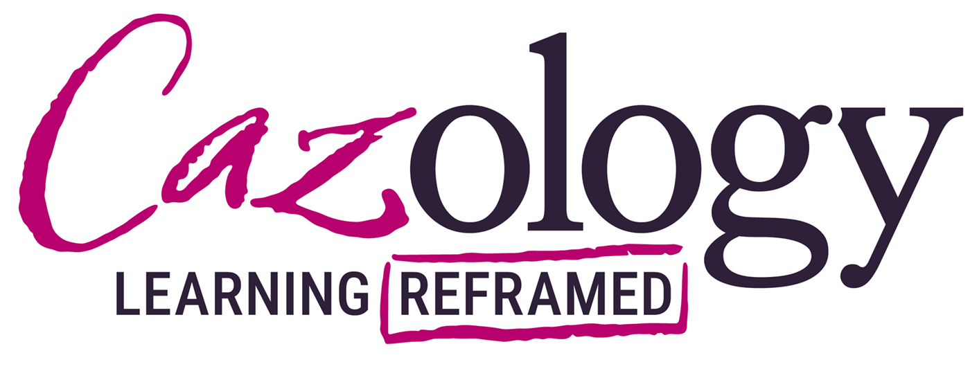
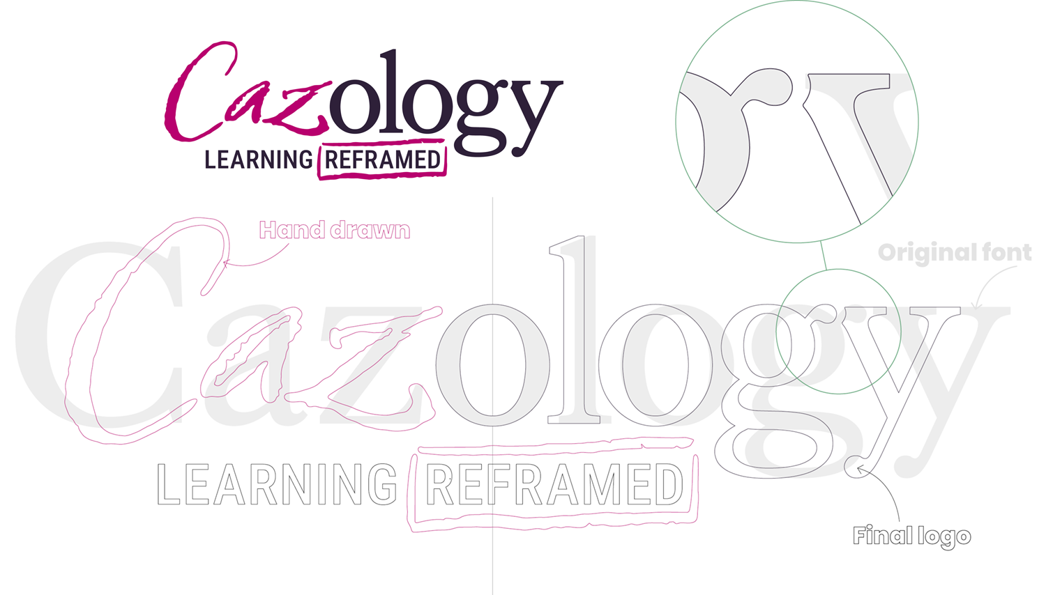
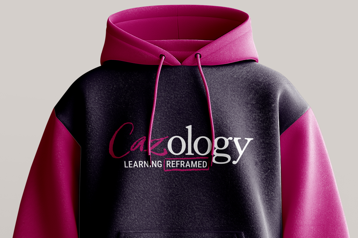
Wordmark Design
The wordmark itself embodies this tension between old and new.
The “ology” portion is based on the classic Caslon typeface, reflecting the academic traditions of higher education. The typography was carefully refined, re-spaced, and adjusted to create balance and clarity.
In contrast, the “Caz” element was drawn by hand.
Bold, expressive strokes introduce human energy into the mark. A visual interruption that reframes the rest of the word.
It feels as though someone has stepped into the system and confidently rewritten part of it.
This subtle disruption communicates the Cazology philosophy instantly:
Respect the system, but don’t be constrained by it.
The Sharpie Device
As the visual language evolved, we explored what “tool” might have created the expressive marks.
The concept began with the familiar red pen of correction, but this felt too closely tied to judgment and academic criticism.
Instead, the idea evolved into something more confident and empowering.
A Sharpie.
Bold. Immediate. Decisive.
The gesture moves away from correction and towards clarity. The act of confidently drawing a new perspective over existing structures.
This device creates a powerful, creative territory for the brand:
The fearless act of redrawing outdated systems.
Colour
A distinctive berry tone, informally nicknamed Cazberry, was developed as the signature colour of the brand’s disruptive marks.
This colour balances boldness with warmth, creating an accent that stands out against more neutral foundations.
The colour acts as a visual signal for moments of reframing and insight, becoming synonymous with Cazology’s role as a catalyst for clarity.
Building a Visual Language
The expressive Sharpie mark-making became more than just a stylistic device.
It evolved into a flexible visual language that could be applied across the brand ecosystem.
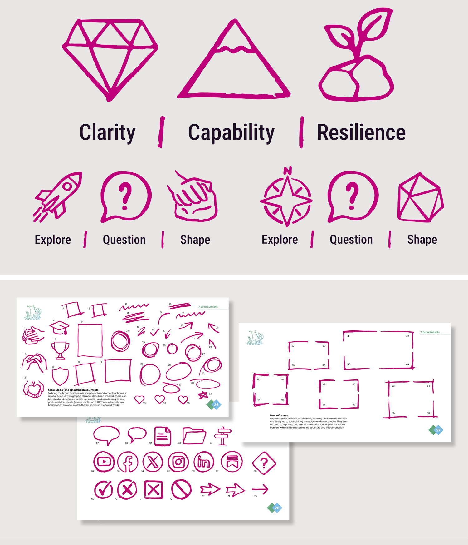
Instead of using off-the-shelf icons, we developed a set of hand-drawn graphic elements that embody the same energetic, disruptive spirit as the wordmark.
These graphics extend the brand’s personality across:
social media
learning materials
presentations
marketing communications
The result is a brand that feels human, energetic, and unmistakably distinct within the education sector.
“Matt’s love for all things visual was clear from the off. He was able to translate my deep academic architecture, whilst showcasing the depth of thought.”
Rebecca Casbeard, Founder
Icon System
The first icons developed represented the core frameworks that underpin the Cazology methodology.
The CCR Framework
Clarity
Capability
Resilience
These form the foundation of how students navigate complex learning environments.
A second set of icons supports the schools-focused part of the methodology:
Explore
Question
Shape
Each icon was drawn using the same expressive visual language, ensuring that the brand’s challenger mindset is consistently communicated across every touchpoint.
The Result
The final identity captures the spirit of Cazology perfectly.
It respects the academic world it operates within, while confidently introducing a new perspective.
The brand feels:
Human
Energetic
Intellectually confident
Instantly recognisable
Most importantly, it communicates the true role of Cazology.
Not another educational framework.
But a catalyst for rethinking how learning works.